
Whether in Delhi or Patna, Google Maps can tell you how clean the air is in your area—here’s how.
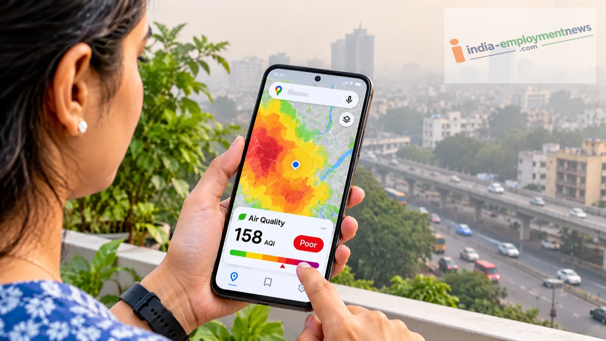
Before stepping out of your home, you can now check the air quality in your area. With the 'Air Quality' feature on Google Maps, it is easy to check the Air Quality Index (AQI) on your mobile phone or computer. Learn how to use it and what the different colors signify.
With the onset of winter, pollution levels have begun to rise in many cities across the country. In particular, regions in North India—including Delhi-NCR—often face the issue of poor air quality. Given this, it becomes important to know how clean the air is around you before heading out, going for a morning walk, or taking your children to a park.
You don’t need to download a separate app for this; you can check the AQI (Air Quality Index) for your area using the Google Maps app already on your phone. Google Maps includes an 'Air Quality' feature that displays air conditions on the map using various colors. Let’s look at how to use it.
How to check the AQI on Google Maps?
If you want to check the air quality on your mobile device, follow these simple steps:
Open the Google Maps app on your phone.
Enter the name of your city, locality, or a specific place into the search bar. You can also select your current location.
Tap on the 'Layers' icon, which is usually located near the search bar.
From the options that appear, select 'Air Quality.'
Once selected, the air quality in your area will be displayed on the map using different colors.
You can tap on a specific area or an air quality station marker on the map to view the AQI and additional related information.
Some users may also be able to access AQI information for their surroundings via the 'Weather' widget found in the 'Explore' tab on Google Maps.
How to check air quality on a computer?
If you wish to check the AQI on a laptop or computer, open the Google Maps website in your browser. Search for the city or area for which you want to know the air quality. Click on the 'Layers' button located at the bottom left of the map and select the 'Air Quality' option. You will then be able to see the air quality conditions displayed on the map.
What do the colors on Google Maps signify?
Google Maps uses various colors to represent air quality:
Green: Air quality is good.
Yellow: Air quality is moderate.
Orange: The air may be harmful to sensitive individuals.
Red: Air quality is poor.
Purple: Air quality is very poor.
Maroon: Air quality conditions are extremely severe or hazardous.
Be sure to also check the AQI numerical value and category associated with each color. Note that methods for measuring AQI and the specific color categories may vary by country.
Things to keep in mind when checking AQI
While the AQI shown on Google Maps helps you understand the air quality in your vicinity, it should not be considered an exact measurement of the air quality right outside your home. According to Google, pollution levels can vary between different monitoring stations. In some cases, there may also be a delay in data availability.
Therefore, pay attention to the location, time, and category when checking the AQI. If the air quality is poor, consider limiting outdoor activities and taking necessary precautions.
