
Instagram New Logo: Instagram gets a new identity; the company has changed its logo after 10 years..
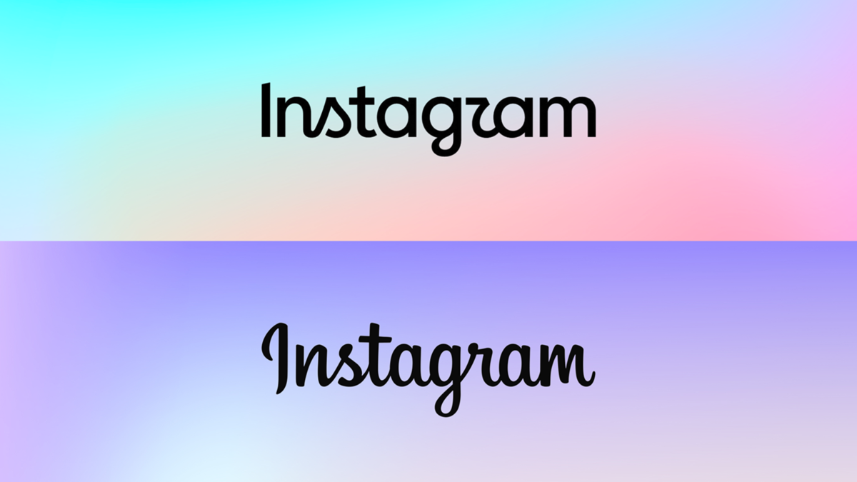
Meta has launched a new wordmark for Instagram—the social media platform's text-only logo. Adam Mosseri, the head of Instagram, explained in a social media post regarding the change that the wordmark at the top of the app hadn't changed in 10 years, so it was time for a refresh.
What does Instagram's new identity entail?
Adam Mosseri stated that the new wordmark is cleaner and more modern than the previous one. It retains references to the original design while upholding Instagram's simplicity and craftsmanship. According to a Meta press release, the team considered hundreds of designs, ranging from all-caps to handwritten styles. Ultimately, they returned to a script font featuring a fluid stroke.
What is the idea behind the new Instagram wordmark design?
Jasmine Probst, Product Design Director at Instagram, explained in a press release issued on August 13 that script reflects personal identity, making it a fitting choice. She noted that the new wordmark is bolder and simpler, yet incorporates touches of the unexpected. It embodies personal expression and a unique voice—elements that have always been at the core of Instagram.
Are there changes to other Instagram design elements as well?
The wordmark isn't the only change. According to Meta's press release, Instagram users will also see an updated "Instagram Sans." Additionally, a new handwriting typeface—"Instagram Pen" (a custom hand-drawn typeface)—and a new "Instagram Mono" font are being introduced.
What did users say about the change to the Instagram wordmark?
Within the first hour of the post announcing the change, over 2,000 users shared their opinions. Some users are fans of the new look; one user commented on Mosseri's post that it is modern and clean, yet fun. Another user remarked that the wordmark has a certain "sparkle" to it. However, other users are not entirely convinced. They are criticizing the fact that the 'S' and 'R' in Instagram are somewhat confusing to read. One user commented that, in their opinion, it is not easy on the eyes. Another user remarked that it is barely readable.
Disclaimer: This content has been sourced and edited from Amar Ujala. While we have made modifications for clarity and presentation, the original content belongs to its respective authors and website. We do not claim ownership of the content.
