
Instagram Logo Change: Did you notice this major change in Instagram? Logo changed after 10 years..
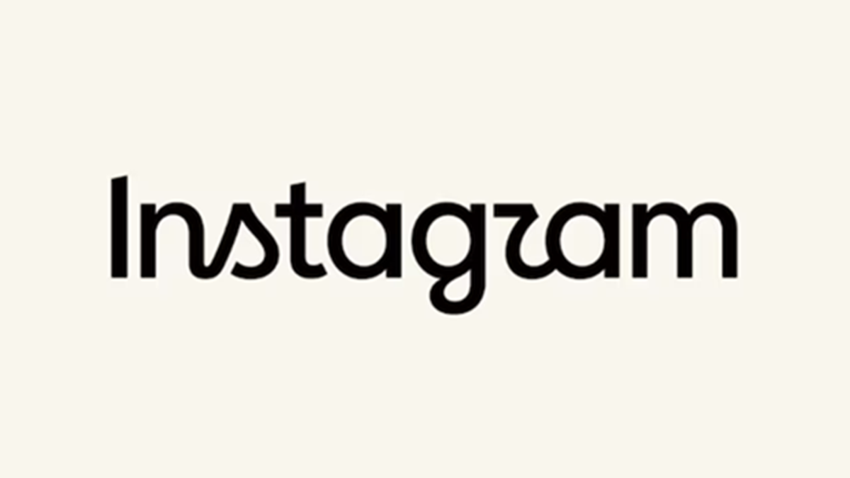
Instagram has revamped its wordmark after a decade. Adam Mosseri, the head of Instagram, announced this change on both Instagram and Threads. The last major shift in Instagram's visual identity occurred in 2016, when the old brown camera logo was replaced by the current gradient icon.
While the new wordmark retains Instagram's familiar script style, the shape and design of the letters have been reworked, giving the name a slightly different and more modern appearance. This significant visual update by Meta has elicited mixed reactions from internet users; while some praise its modern and clean aesthetic, others are mocking the new lowercase ‘r’, calling it "Instagzam."
In an Instagram post, Adam Mosseri explained that the typography of the name displayed at the top of the app has been made sharper, cleaner, and more modern, all while preserving the brand's core identity and simplicity. The platform's colorful gradient camera icon remains unchanged, and the update is limited solely to the typography used for the Instagram name.
Mixed User Reactions
Users are divided over this new wordmark, which has arrived after ten years. On one hand, many have praised the fresh look, describing it as "love this" or an "excellent modernization," while on the other, some have remarked that it looks "AI-generated." The new design of the letter ‘r’ has sparked the most discussion; one user commented, "The new wordmark now looks like Instagzam."
Disclaimer: This content has been sourced and edited from News18 Hindi. While we have made modifications for clarity and presentation, the original content belongs to its respective authors and website. We do not claim ownership of the content.
